
design
PROCESS
palette
NATURE'S
AND
effect
ON THE
ITS
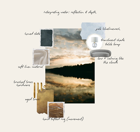
Nature’s palette has always been the best reference. There’s a quiet order to it—the way a river curves, how a path guides you forward, how light settles at the edge of the day. Nothing feels forced. Everything has a purpose. When we look to nature for inspiration, we’re reminded that creation balances beauty and function effortlessly. Color, texture, rhythm, and rest all exist together, without explanation. These are the same principles we aim for in well-designed spaces. Sometimes the best design inspiration isn’t something new to discover. It’s something we’ve been surrounded by all along.


Nature doesn’t present ideas all at once; it guides the eye gradually. A curve invites movement forward. Color appears in small, intentional moments. Light draws attention upward, encouraging the eye to lift and explore rather than settle in one place. Vertical elements—trees, changes in elevation, shifts in sky—create a natural sense of hierarchy and progression. Texture keeps the experience grounded, giving balance to that movement.
These cues show up again and again in the natural world, and they translate directly into thoughtful design decisions. Circulation becomes softer. Color is used sparingly, as punctuation rather than saturation. Vertical moments—through form, light, or proportion—help guide attention and create a sense of openness without overwhelming the space. Materials are chosen for how they feel in use, not just how they look at a distance.
Rather than forcing a focal point, nature allows spaces to unfold, directing attention through rhythm, contrast, and subtle shifts in scale. The result feels intuitive, calm, and familiar, even when the design itself is new.
.png)